


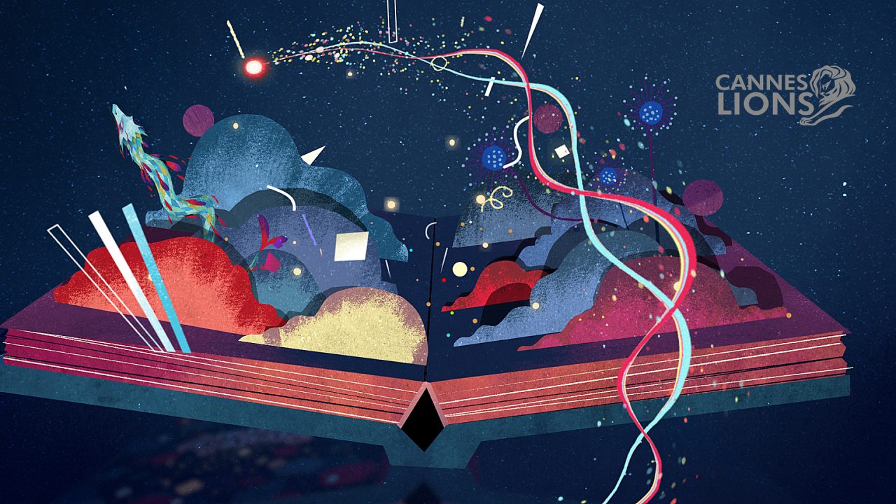
-
Fanta
Pac-Man
Fanta enters the Pac-Man universe, thanks to a partnership between Bandai Namco Entertainment and the Coca-Cola Company that spawned an exclusive mobile game featuring the iconic yellow chomper and his ghostly foes.LOBO was invited by Havas agency to collaborate on the promotional campaign for the app launch.
-
Life's Good
Better Choices Make a Better World
LOBO and TBWA\Chiat\Day New York teamed up to create a campaign for LG that’s filled with messages of positivity and awareness, spread through an irresistibly charming visual style and animation technique.
-
SAP Office Cat
Van Gogh
SAP is the market leader in enterprise application software, helping companies of all sizes and in all industries run better through technology. To turn business owners’ attention to the AI tools SAP offers, BBDO NY decided to capitalize on the recent buzz around generative art and created a film featuring an animated cat painted in the style of Van Gogh.
W
e
a
r
e
L
o
b
o
,
a
c
r
e
a
t
i
v
e
s
t
u
d
i
o
d
e
d
i
c
a
t
e
d
t
o
m
o
v
i
n
g
i
m
a
g
e
s
.
O
u
r
e
x
p
e
r
t
i
s
e
c
o
v
e
r
s
a
b
r
o
a
d
r
a
n
g
e
o
f
m
e
d
i
a
a
n
d
t
e
c
h
n
i
q
u
e
s
,
l
i
k
e
2
D
a
n
i
m
a
t
i
o
n
,
s
t
o
p
m
o
t
i
o
n
,
3
D
,
V
F
X
a
n
d
l
i
v
e
a
c
t
i
o
n
.
L
e
t
u
s
s
h
o
w
y
o
u
a
b
i
t
o
f
o
u
r
w
o
r
k
L
e
t
u
s
s
h
o
w
y
o
u
a
b
i
t
o
f
o
u
r
w
o
r
k
W
o
u
l
d
y
o
u
l
i
k
e
t
o
s
e
e
m
o
r
e
o
f
o
u
r
w
o
r
k
?
W
o
u
l
d
y
o
u
l
i
k
e
t
o
s
e
e
m
o
r
e
o
f
o
u
r
w
o
r
k
?
F
e
e
l
f
r
e
e
t
o
c
o
n
t
a
c
t
u
s
F
e
e
l
f
r
e
e
t
o
c
o
n
t
a
c
t
u
s